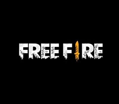
The Free Fire Max logo is a symbol of the ascent of the game, depicting its change from a usual mobile battle royale to a top quality, high-definition gaming experience. On its debut in September 2021, Free Fire Max brought the amplified graphics, lighting, and sound effects with the sole purpose of giving the players a more immersive experience.
The Evolution of the Free Fire Max Logo
Initial Design
The first Free Fire Max emblem had similarities in the appearance with the previous one, where the main traits were the strong and aggressive font that accompanied the idea of a fight and the action. The core of the design was to give players an idea about the game’s dynamic and intense play styles.
Transition to Premium Aesthetics
The brand logo changed to a more aesthetical look when the Free Fire Max decided to be a premium product. The redesign featured more elegant fonts, metallic effects, and the use of colors like golden-yellow and silver giving the logo a blend of luxury and futuristic appeal sense.
Key Elements of the Free Fire Max Logo
Typography
The typeface applied in the Free Fire Max logo is that of the bold and highly memorable one, which gives the idea of speed and action to the viewer. Besides, the letter “I” in “FIRE” is designed as a knife, thus suggesting that it is a combat game.
Color Scheme
Free Fire Max is primarily associated with a color theme of gold and black. Gold is the color of rare, outstanding features, high-end products, and the winning of the game of which are all the main ideas that are associated with Free Fire Max. Black is the only add-on color and it creates balance and at the same time it brings out the features of the logo like its strength and mystery.
Gradient and Shadows
The Free Fire Max logo no longer relies on the single flat color of its predecessor but uses gradient and shadows to produce a 3D effect. This aesthetic choice deeply enhances the sense of depth which corresponds to the high-definition gaming experience of Free Fire Max.
Logo Placement in Game & Marketing
The Free Fire Max logo may have been seen on the loading screens but it is still regarded as the central visual identity of the game:
- Splash Screens: The logo gets displayed at app launch thereby contributing to a very strong first impression.
- Esports Broadcasts: You can find it on jerseys, banners, and digital backdrops at close quarters without missing a beat.
- Promotional Events: It has been spotted in Free Fire tournaments, collaboration announcements, and redeem code releases.
Why the Logo Matters in Player Perception
The Free Fire Max logo greatly influences players to have a positive perception of the game:
- Professionalism: With the well-designed logo, the brand of Free Fire Max becomes more credible.
- Brand Recognition: A well-designed logo can direct players to instantly recognize whether new updates, versions, or events are related to Free Fire Max.
- Emotional Impact: In fact, within time, apart from the nostalgia, the players will get the logo to be a sign of them being brave, and loyal—especially when it comes to esports tournaments.
Conclusion
The Free Fire Max logo is not only a mere visual element but it is a sign of the game’s progression and its determination to give a high-quality gaming experience. Through the strategic use of designs, the logo manages to combine all the features of Free Fire Max—vibrant action, high-end technology, and most importantly, innovation. As the game moves forward with the changes, the logo is there reminding about its voyage and its goals.
Also Read:Hyperliquid Launches Permissionless Spot Quote Assets on Mainnet — USDH Becomes First Quote Asset
