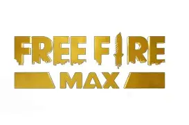
Free Fire Max, the premium version of the popular battle royale title Garena Free Fire, has made waves not just for its enhanced graphics and immersive gameplay but also for its distinct branding—especially the Free Fire Max logo. A game’s logo is more than just a visual—it’s a representation of its identity, evolution, and connection with its community.
In this article, we dive deep into the Free Fire Max logo—its design features, color psychology, evolution, and why it matters in the current mobile gaming landscape.
Understanding the Free Fire Max Brand
Before diving into the logo specifics, it’s important to understand what Free Fire Max stands for. Designed for players who crave better visuals and smoother gameplay, Free Fire Max brings ultra-HD textures, realistic shadows, and enhanced sound effects to the original game. It targets mobile gamers who want a high-quality experience without switching platforms.
This premium feel is clearly reflected in the game’s logo, which speaks volumes about the brand’s upscale image.
The Evolution of the Free Fire Max Logo
The Free Fire Max logo has evolved over time to reflect its growth and identity:
- Initial Logo: Shared design elements with the original Free Fire—bold, aggressive typography symbolizing action and combat.
- Max Upgrade: Introduced sleeker fonts, more metallic textures, and golden-yellow hues that evoke premium quality and futuristic vibes.
- Modern Variant: Recent updates include more polished gradients, shadow depth, and slightly curved edges to appeal to both old fans and a newer audience.
The evolution mirrors how the game has matured, from a survival-centric format to a visually rich battle royale ecosystem.
Key Elements of the Free Fire Max Logo
1. Typography
The font used in the Free Fire Max logo is bold and impactful. It conveys a sense of urgency and action. The letter “I” in “FIRE” is represented as a dagger, reinforcing the combat-oriented nature of the game.
2. Color Scheme
Gold and black dominate the Free Fire Max branding. Gold symbolizes exclusivity, luxury, and mastery—key themes in Free Fire Max. Black adds contrast and highlights strength and mystery.
3. Gradient and Shadows
Unlike the flat colors of the original Free Fire logo, the Max version includes gradients and shadows to create a 3D effect. This design decision enhances depth, matching the high-definition gameplay experience of Free Fire Max.
Logo Placement in Game & Marketing
The Free Fire Max logo isn’t just on loading screens—it’s a core part of the game’s visual identity:
- Splash Screens: The logo appears during app launch, creating a strong first impression.
- Esports Broadcasts: Prominently placed on jerseys, banners, and digital backgrounds.
- Promotional Events: Used in free fire tournaments, collab announcements, and redeem code launches.
- Merchandise: From hoodies to gaming accessories, the logo is featured heavily in branded gear.
Why the Logo Matters in Player Perception
The Free Fire Max logo plays a huge role in how players perceive the game:
- Professionalism: The polished design enhances the credibility of the Free Fire Max brand.
- Brand Recognition: A strong logo helps players instantly recognize updates, versions, or events related to Free Fire Max.
- Emotional Impact: For long-term players, the logo can evoke nostalgia, pride, and loyalty—especially when seen in esports tournaments.
Free Fire Max vs. Free Fire: A Logo Comparison
| Feature | Free Fire Logo | Free Fire Max Logo |
| Font Style | Basic, Blocky Font | Sleek, Metallic Font |
| Color Palette | White & Orange | Black & Gold |
| Icon Element | Dagger as “I” | Dagger + Gradient Glow |
| Overall Impression | Casual Battle Royale | Premium Battle Royale |
Fans React: Community Buzz Around the Logo
Gamers across the globe have taken to social media to share their views:
- “The new Free Fire Max logo is straight 🔥. Feels like I’m playing a console game on mobile.”
- “Loving the gold accents! Finally feels like the Max version is more than just graphics.”
- “It sets the tone for competitive play. Makes me feel like I’m stepping into something elite.”
Such feedback shows how logos can deeply influence a game’s image, especially among esports fans and mobile gaming influencers.
Free Fire Max Logo in Modded Versions
Interestingly, many modded APKs or United Mods versions of Free Fire Max replicate or tweak the official logo. These often include neon edges, animated glows, or custom badge overlays to differentiate features. However, such use raises intellectual property concerns and undermines the originality of Garena’s design.
Still, it highlights how powerful and desirable the official Free Fire Max logo has become—even unofficial developers want to use or replicate it.
Future Possibilities: Will the Logo Evolve Again?
Given the growing competition in mobile battle royale games like PUBG Mobile, Apex Legends Mobile, and Call of Duty Mobile, Free Fire Max may refresh its logo again in the future. Possible updates could include:
- Dynamic Logos: Slight animations during app launch or transitions.
- Seasonal Variants: Logos customized per event or theme, like Halloween or summer.
- Interactive Icons: In-app logo reactions when tapped (especially during events).
These ideas could help keep the Free Fire Max branding fresh and engaging in 2025 and beyond.
Final Thoughts
The Free Fire Max logo is more than a visual design—it’s a statement of quality, identity, and competitiveness in the mobile gaming world. With its gold-black theme, bold typography, and powerful presence across media, the logo perfectly encapsulates the Free Fire Max experience: premium, fast-paced, and community-driven.
As Free Fire Max continues to evolve with seasonal updates, graphics improvements, and esports growth, its logo will remain a cornerstone of how players recognize and connect with the game.
Also Read: Oxygen Miner Daily Combo 1 August 2025
